ESPACES ARCHITECTS
BRIEF
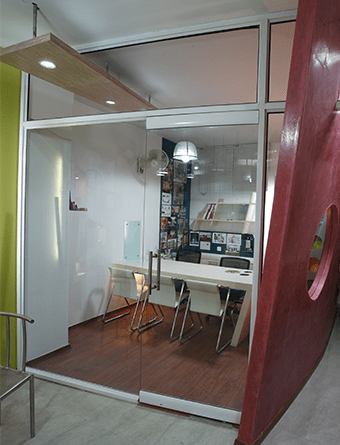
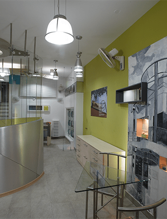
Located in New Delhi, Ar. Nikhil Kant Agarwal’s office is spread approx. 850 sq. ft. carpet area and reflects his philosophy and thoughts in design and gives an overview of a youthful and vibrant work place. Dictated by functionality, the space planning sees neat segregation of space. The emphasis was on creation of zones that offer free movement and interesting ambience created with the use of forms and colors. The reception adjoined with waiting area was designed near the entrance followed by a conference room for three people and an informal seating which doubles as a coffee table.
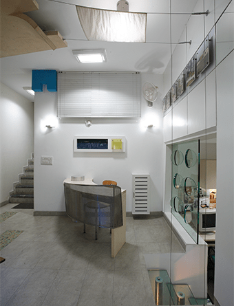
As one enters down to reach the office, one gets the glimpse of the entire office with different forms and colors Interplaying with each other. An abstract partition painted with cream (stucco texture from okios) paint lays emphasis on the firm’s logo which is further highlighted by cove lighting and continues on the ceiling with ends supporting a silk cloth stretched with tension wires. The texture of the cloth is highlighted by a light fixture above it.
CONCEPT
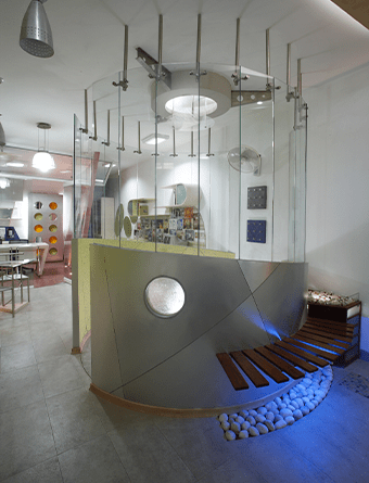
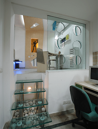
The office reflects architects philosophy and thoughts, it has been kept very youthful and vibrant in it’s treatment. The foremost importance was given to the functional requirement and at the same time architects didn’t wanted to overcrowd things and went for only one main cabin instead of two separate for each one of us. It was decided to work with seven workstations, four of which were in studio at lower level and three of them at upper level to be used by us and accounts staff. Architects had clear demarcation of spaces and its utility. Emphasis was given to create better movement and interesting ambience by use of forms and colours. The space had two levels with lower being 3 feet down from upper level and having a height of 8 feet, further it had a solid wall with a door. Our first inference on seeing the raw hall for the first time was to place our studio in lower half and to remove the solid wall to make it a part of upper floor. The main cabin was placed at the extreme end of hall at upper level. It was decided to have reception adjoined with waiting near the entrance followed by a conference for 3 people and an informal seating which can be used as a coffee table.
Once the layout was freeze based on our requirement ,it was turn to make interesting composition , an advantage being its a self used space and a most important part of our life we were free to put our creative abilities to its fullest without having any inputs from anyone. An enthusiasm followed to create a motivating space, it’s like our first house, it’s a space which is our identity, each nook and corner has a story of its own.
As enters down to the office visually one gets the glimpse of the whole office with different forms and Colours interplaying with each other. An abstract partition painted with cream (wax texture from okios) paint, emphasis on the firm’s logo highlighted by cove lighting, continues on the ceiling with ends supporting a silk cloth stretched with tension wires, the texture of the cloth is highlighted by light above it.
IMAGE GALLARY